


 FREE + PRACTICAL
Join Practical Tools Explained and get practical website and automation tips that help small businesses capture more leads, follow up faster, and waste less time on manual work.
No fluff. No spam. Just useful advice for small business owners who want better systems and more revenue.
Stop losing leads to slow websites and manual tasks. Get a complete Website and Workflow Checkup for just $97. Start Here→
The problem isn’t usually that small business owners lack data. It’s that their data is distributed across four or five tools that don’t share information, require separate logins, and each tell a different part of a story that nobody has time to manually stitch together. The CRM has contact and pipeline data. The invoicing tool has revenue data. The project management tool has task and timeline data. The scheduling tool has appointment data. Each of these systems knows something useful. None of them know everything. And getting a complete picture of how the business is actually performing on any given Tuesday requires opening all of them, cross-referencing manually, and building a mental summary that’s already partially outdated by the time you’ve finished.
A unified dashboard solves this by pulling the data from each of those sources into one view. The goal is not to replace any of the tools. It’s to create a reading layer on top of them that gives you the information you need to make decisions without making those decisions dependent on a manual data aggregation process.
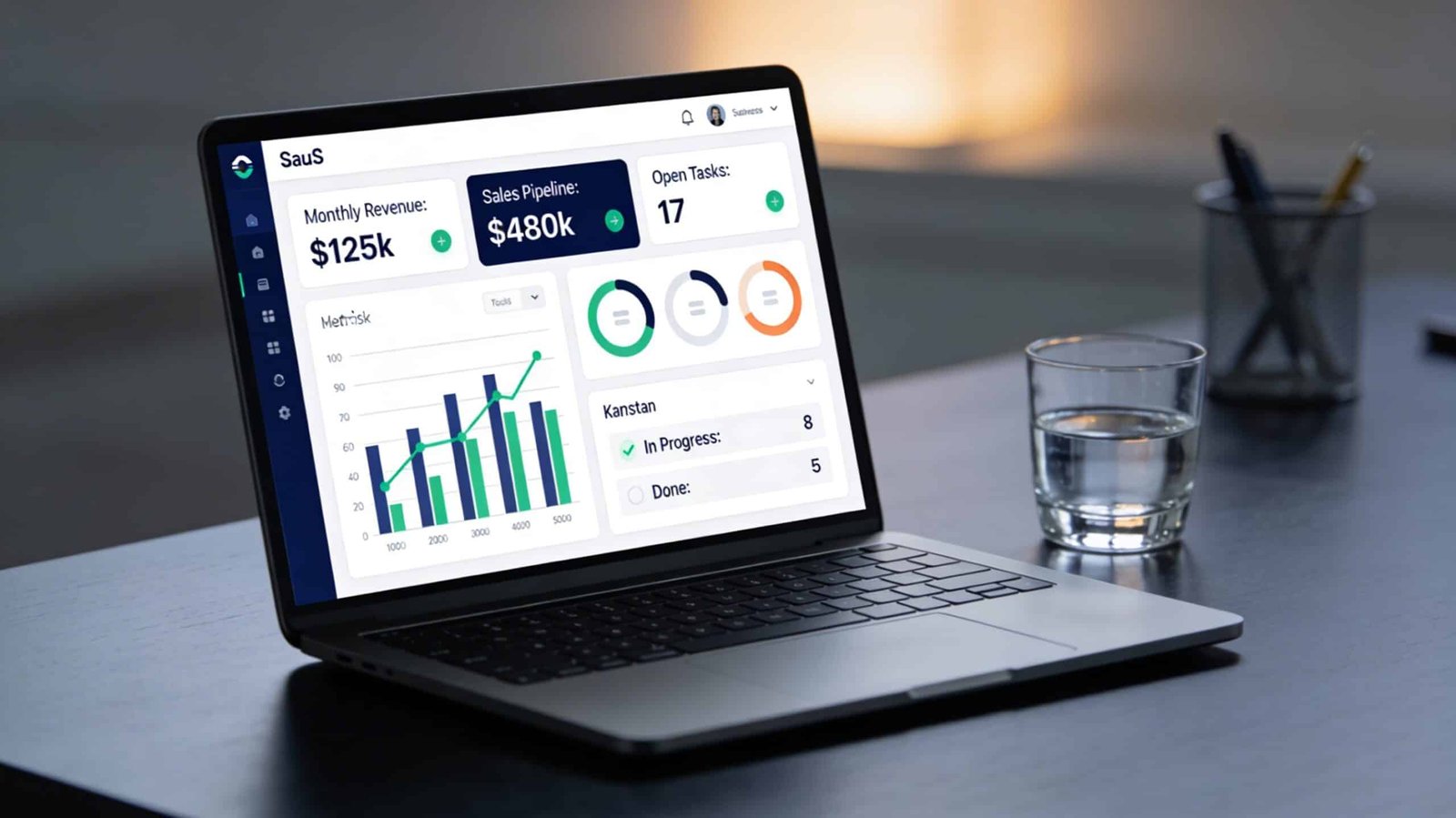
What a Useful Dashboard Actually Shows
Before connecting anything, define what decisions the dashboard needs to support. This determines which data points matter and which ones are noise. For a service business, the decisions that drive revenue are usually: how many leads are currently active in the pipeline, where are they sticking, which clients are active versus at risk of churn, what’s the current revenue versus target, and what tasks are overdue or at risk of slipping. Everything that feeds those decisions belongs on the dashboard. Everything else is detail you can find when you need it.
The metrics that show up on most small business dashboards but that most owners don’t actually look at are vanity metrics. Total contacts in the CRM. Total emails sent. Total page views from the marketing side. These are informational rather than decisional. A dashboard built around vanity metrics looks comprehensive but doesn’t actually make it easier to run the business. A dashboard built around the five questions above does.
Option 1: Use Your CRM’s Native Reporting
The simplest version of a unified dashboard exists inside most CRMs already, and it’s underused. HubSpot’s reporting dashboard, for example, allows you to build custom report views that combine deal pipeline data, contact activity, task completion rates, and email engagement into a single screen. If your CRM is already the primary tool your business runs on, its native reporting is the right first step before building anything more complex.
Most CRMs allow you to customize the default dashboard view with the widgets and metrics you actually use. Spend 30 minutes configuring your CRM dashboard to show the five decisional metrics listed above rather than the default view. This costs nothing and produces immediate improvement in how quickly you can assess your business position on any given day.
The limitation of CRM-native reporting is that it only knows what lives inside the CRM. Revenue data from your invoicing tool, project status from your project management tool, and appointment data from your scheduling tool don’t automatically appear there unless those tools are connected. For businesses where the pipeline-to-revenue picture matters most, CRM-native reporting is often sufficient. For businesses that need to see operational and financial data alongside pipeline data, you need to pull from multiple sources.
Option 2: Use a Middleware Dashboard Tool
Databox, Klipfolio, and Google Looker Studio are designed specifically to pull data from multiple sources and display it in a single configurable dashboard. All three have integrations with common small business tools including HubSpot, Pipedrive, Stripe, QuickBooks, Google Analytics, and most project management platforms.
Databox has the lowest setup barrier for non-technical users. Its pre-built dashboard templates connect to most common tools in a few clicks and start pulling data immediately. A basic connected dashboard showing pipeline, revenue, and website traffic together can be live in under two hours with Databox’s template library. The free tier allows three connected data sources, which is sufficient for most small business dashboards. Paid plans start at around $47 per month and add more sources, users, and reporting frequency.
Google Looker Studio is free, connects to a wide range of sources, and produces more visually customizable reports than Databox. The tradeoff is that configuration requires more manual setup. You’re building reports from components rather than configuring pre-built templates, which gives you more control but takes more time upfront. For businesses that already have someone comfortable with Google’s ecosystem and want full control over the layout and logic of their reports, Looker Studio is worth the extra setup time.
The connection between these dashboard tools and your source applications is handled either through native integrations, direct API connections, or through Zapier and Make as intermediary tools. For the most common tool combinations, native integrations exist and require only authentication. For less common combinations, a simple Zapier automation that pushes data from the source tool to a Google Sheet, which Looker Studio can then read, handles most gaps without requiring any developer work.
Option 3: Centralize Through Automation First
A more robust approach for businesses with more complex data needs is to use automation to centralize data into a single structured location before connecting a dashboard to it. The typical implementation uses Make or Zapier to create automations that write key data points to a Google Sheet or Airtable database whenever they change in the source system. The dashboard then reads from the centralized database rather than pulling from multiple sources directly.
This approach has more setup overhead but produces a more reliable and flexible result. The centralized database becomes an audit trail as well as a data source, which means you can look back at historical performance rather than only seeing the current state. It also means your dashboard isn’t dependent on the uptime or API availability of five different tools simultaneously.
For example, when a deal moves to closed-won in your CRM, an automation writes the client name, deal value, and close date to a “Revenue” sheet. When an invoice is paid in your invoicing tool, another automation writes the payment amount and date to the same sheet. When a project is marked complete in your project management tool, another automation writes the project name and completion date to a “Projects” sheet. Looker Studio then reads both sheets and produces a combined revenue and delivery report that neither tool could generate on its own.
This is the same logic behind building a strong operational backend before layering reporting on top of it. Reporting is only as clean as the data underneath it. If the data going into your sources is inconsistent or incomplete, the dashboard will reflect that inconsistency rather than hide it. Fixing the data habits comes before or alongside building the dashboard, not after.
The Weekly Review Habit That Makes the Dashboard Worth Building
A dashboard that nobody looks at is an automation project that wasted your time. The value of a unified dashboard is fully realized only if there’s a regular, short review habit attached to it. Fifteen minutes on Monday morning to look at the five decisional metrics, identify anything that needs attention before the week starts, and make a note of anything that’s trending in a direction you need to address. That’s it. The dashboard doesn’t require analysis. It requires a glance with the context to understand what you’re looking at.
Most business owners who implement a functional unified dashboard report that the primary value isn’t the insight itself. It’s the reduction in background anxiety that comes from knowing the state of the business without having to dedicate an hour to figuring it out. When you can look at one screen for 60 seconds and know where you stand, the constant low-level uncertainty about how the business is performing stops consuming mental bandwidth that’s better spent elsewhere.
If you’re approaching this as part of a broader operational cleanup, the business tool audit is the right starting point. Before connecting tools to a dashboard, it’s worth confirming that the tools you’re connecting are actually earning their place in the stack. A dashboard built on top of a bloated, fragmented tool set produces a clear view of a complicated mess. Clean the stack first, then build the reporting layer on top of what remains.
The goal is a single reliable view of your business that you can check in under two minutes and that keeps you making decisions based on current reality rather than whatever you last happened to notice.


[…] haven’t yet systematized the backend that this inbox automation feeds into, setting up a clean CRM and unified dashboard first gives the inbox automation somewhere useful to route the leads it captures. An automated […]