Start here
Not sure what to fix? Start with the $97 checkup.
Written review. Prioritized fix list. 3 to 5 business days. No call needed.
Get the Checkup → Book a free 15-min call

Written review. Prioritized fix list. 3 to 5 business days. No call needed.
Get the Checkup → Book a free 15-min call
A written audit of your site, lead path, ad tracking, and follow-up gaps. Delivered in 3 to 5 business days. No call required.
Have questions first? Book a free 15-min call
Stop losing leads to slow websites and manual tasks. Start with the $97 Website and Workflow Checkup. Get $97 Checkup
This post may contain affiliate links, which means I may earn a small commission at no extra cost to you. I only recommend tools I believe can genuinely help your business.
The most expensive brand identities and the least effective brand identities share a common problem: inconsistency. A business that uses three different logos across its platforms, posts in five different visual styles on social media, and has a different color palette on its website than its business cards has a brand identity problem that no designer can solve. Brand identity is not a logo. It is consistency applied over time. And consistency costs nothing. It costs attention, discipline, and a one-weekend investment in building the template set that makes consistency automatic.
The $3,000 brand identity package from a design agency gives you beautiful assets that sit in a folder. The weekend brand build described here gives you a working visual identity that you actually apply to everything you publish, post, and send. The second approach produces better business results because a good brand used consistently beats a great brand used inconsistently every single time.
Here is the complete Saturday-Sunday plan to build your visual brand identity from scratch, without a designer, using only free tools.
Every visual brand identity is built on three decisions: your primary color, your headline font, and your body text font. That is it. Not a ten-page brand guideline document. Not a mood board. Not a brand archetype workshop. Three decisions that you will apply to everything your business produces from this point forward.
Choose your primary color. Open any color picker tool online and select one color that represents your business. Write down the hex code (the six-character code that starts with #). This color will appear in your logo, your social media posts, your website headers, your email signature, and your business cards. One consistent color across every touchpoint creates recognition faster than any other visual element.
Choose a secondary color that complements your primary. Coolors.co generates complementary color palettes for free. Pick one secondary color and write down its hex code. The primary color is used for headlines, buttons, and emphasis. The secondary color is used for backgrounds, borders, and subtle accents. Two colors are enough. Three is the maximum. More than three colors creates visual noise that undermines the consistency you are building.
Choose your fonts. You need two: one for headlines and one for body text. Google Fonts provides hundreds of free options that are available across every platform. For headlines, choose something bold and distinctive. For body text, choose something clean and readable. Montserrat for headlines and Open Sans for body text is a combination that works for almost any business. Write down both font names.
You now have the three fundamentals documented: primary color hex code, secondary color hex code, headline font, and body font. These four specifications are your brand identity. Everything else is application.
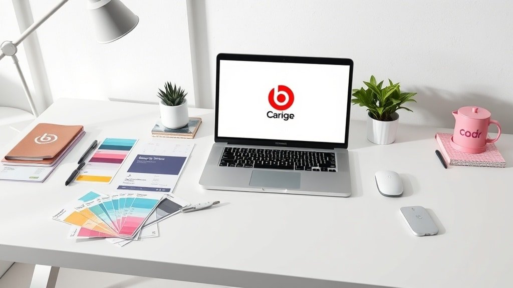
Canva’s free logo maker is sufficient for most small businesses starting out. The logo does not need to be a work of art. It needs to be recognizable, clean, and consistent with your brand colors and fonts.
For most service businesses and personal brands, a simple wordmark (your business name in your headline font, in your primary color) is the best starting point. It is clean, professional, and easy to apply everywhere. You can add an icon or symbol later as your brand evolves, but starting with a wordmark means you can be consistent immediately without waiting for the perfect icon design.
For product businesses, a simple icon plus wordmark combination works well. Canva provides icon libraries that you can customize with your brand colors. Choose a simple icon related to your industry, place it next to your business name, and export it in PNG format with a transparent background.
Export your logo in three formats: a horizontal version for website headers and email signatures, a square version for social media profile photos, and a favicon version (small square) for browser tabs. Having all three ready means you can apply your logo to every platform without needing to recreate it each time.
Templates are what make brand consistency automatic. Without templates, every social media post, email, and document requires visual decisions that lead to inconsistency. With templates, you fill in the content and the brand stays consistent regardless of who creates the asset or what day it is created.
Create these four templates in Canva using your brand colors, fonts, and logo. A social media post template for your primary platform (1080 x 1080 for Instagram, 1200 x 627 for LinkedIn, or the appropriate dimensions for your chosen platform). An email header template that includes your logo and brand colors. A business card design with your logo, name, title, and contact information. A presentation slide template with a title slide and a content slide.
Each template takes about 15 to 20 minutes to create. By Saturday evening, you have four templates that cover the vast majority of visual assets your business will need. Every future social media post starts from the template. Every email goes out with the branded header. Every meeting uses the branded presentation. The consistency happens automatically because the templates enforce it.
For video content that needs to match your brand identity, CapCut lets you create video templates with your brand colors and fonts. Save your brand intro, lower thirds, and text overlay styles as project templates. Every video you edit starts with the same branded elements, maintaining visual consistency across video content alongside your static assets.
Sunday morning is application day. Take your new brand assets and apply them to every existing touchpoint where your business appears. This is the step most people skip, and it is why most DIY branding efforts fail. Creating the assets is only half the work. Applying them consistently across every platform is what creates the recognition that drives business results.
Update your website header with your new logo, brand colors, and fonts. Update your social media profile photos to the square version of your logo across every platform. Update your bio and banner images on each platform to reflect the new brand. Update your email signature with your logo and brand colors. If you have a Google Business profile, update the photos there as well.
The goal is that someone encountering your business on any platform sees the same colors, the same fonts, and the same logo. This visual consistency creates a subconscious sense of professionalism and trustworthiness that no single brilliant design can achieve on its own. The person who sees your Instagram post, visits your website, and receives your email should have a seamless visual experience across all three.
The connection between visual brand identity and your overall personal brand is covered in the guide on building a personal brand that generates business, which covers the strategic layer that sits on top of the visual foundation you are building here.
The final step is producing content using your new templates so that your brand becomes visible to your audience immediately. Do not save the new brand for a future “launch day.” Start using it now.
Using your social media post template, create 15 to 21 posts covering the next three weeks. Each post uses the template, which means the colors, fonts, and logo are consistent automatically. You only need to write the content and swap any images. Vista Social schedules and publishes these posts across all your connected platforms, maintaining your new brand consistency without daily effort.
By the time those three weeks of content have published, your audience has seen your new brand identity 15 to 21 times. Repetition creates recognition. After three weeks of consistent visuals, your business starts to look established and professional regardless of how new the brand actually is.
Repetition creates recognition, and recognition creates trust. A business that uses the same two colors, the same two fonts, and the same logo across every touchpoint for six months becomes visually memorable to its audience. They may not consciously notice the consistency, but they subconsciously register your business as professional, established, and trustworthy.
The brands that fail visually are not the ones with bad design. They are the ones that change their look every few months, use different colors on different platforms, or post content that looks like it came from five different businesses. The brand you build this weekend does not need to be permanent. You can refine and evolve it over time. But it needs to be consistent for at least three to six months before you consider any changes, because the recognition only builds through sustained repetition.
The broader content strategy that sits on top of your visual brand, covering how to create content efficiently across multiple channels, is detailed in the complete content creation stack guide, and the video-specific approach is covered in the social media video strategy guide.
Saturday morning: choose your primary color, secondary color, headline font, and body font. Create your wordmark logo in three formats. Saturday afternoon: build your social media template, email header template, business card, and presentation template. Sunday morning: apply the brand to every existing platform and touchpoint. Sunday afternoon: create and schedule three weeks of branded content.
Total cost: zero dollars using Canva’s free plan and Google Fonts. Total time: approximately eight focused hours across two days. The result: a consistent visual brand identity that makes your business look professional across every touchpoint, with templates that ensure that consistency is maintained automatically going forward. That is more than most businesses achieve after spending thousands on a design agency, because the consistency, not the design quality, is what drives the business result.
If you found this helpful, you might also want to read our guide on how to create business video content.
If you found this helpful, you might also want to read our guide on ai video toolkit small business.
If you found this helpful, you might also want to read our guide on build social media content calendar.
Two fixed-scope builds that fix both problems. No retainer to start. Live in under two weeks.


")
")


[…] If you found this helpful, you might also want to read our guide on build business visual brand identity. […]